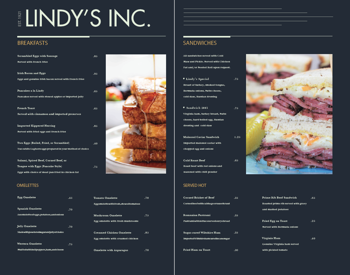
This project involved taking a menu that was arguably poorly designed and placing some of the menu contents into a more structured format. The menu I redesigned in this case is that of Lindy’s.
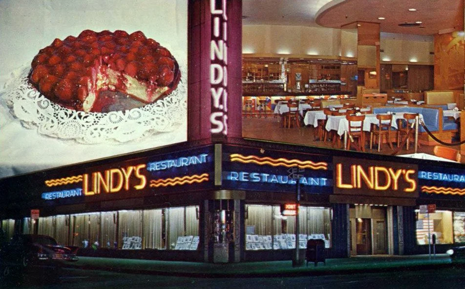
This is the finished redesign. Below this, you can see an original menu from Lindy’s made in the 1930s (left), an updated menu from the 1960s that I used elements as inspiration from (middle), and an image of Lindy’s taken at some point in the 1970s that I utilized as grounds for a new color scheme (right). I streamlined the original’s cluttered blocks of copy and introduced more hierarchy for visual clarity. In regard to the 1960s menu, I used the line motif in the center and integrated it as a representation of the Empire State building in the top right of the redesign, since both of the locations are in Manhattan and it suits the locale-based atmosphere of the restaurant.


